Finding Your Brand’s Typeface Soulmate
Choosing logo fonts for your branding is like crafting a love letter to your customers. It’s about making a connection from the first glance. And just like the perfect love letter, it should be easy to read, pleasant to look at, and reflective of who you are.
The Dance of Logo Font Pairing
When fonts are in sync, they dance beautifully together, creating a visual rhythm that draws in the reader. Like dance partners, they must complement each other’s moves—strength meeting grace, boldness paired with subtlety. This dance is not just about looking good. It’s about creating a feeling, setting a tone, and telling a story.
Why Two Fonts Are the Magic Number
You might be tempted to throw a font party, but when it comes to logos, think of it as an intimate get-together instead. Two fonts allow each to shine without stepping on each other’s toes. They can converse, complement, and coexist without the clutter.
Fonts That Echo Your Core
Just as we express ourselves through words, fonts express the core of your brand. Is your brand voice fun, quirky, and a little rebellious? Or does it carry the weight of tradition and trust? Perhaps it’s sleek, modern, and full of energy. Your fonts should be the visual embodiment of these traits.
Speaking of unique identities, it’s crucial to understand the impact a logo has on your brand’s perception. Using mass-produced logos might seem like a quick fix, but it could cost you your brand’s uniqueness and the personal connection with your audience. Discover why a custom logo is key to standing out and making a lasting impression.
Time-Tested Combos and New Trends
There’s a reason some font pairings stand the test of time. They’re classic, reliable, and versatile. But the world of typefaces is always evolving. Today’s trends might include bold headers with minimalist subtitles, or dynamic serifs that bring a fresh twist to traditional styles.
Visibility Across All Platforms
Your logo will appear on various platforms, from the smallest mobile screens to large street-side billboards. It should always be clear and legible. This is non-negotiable. A font that can’t be read can’t communicate and fails to serve its primary purpose.
Expanding on Font Pairings
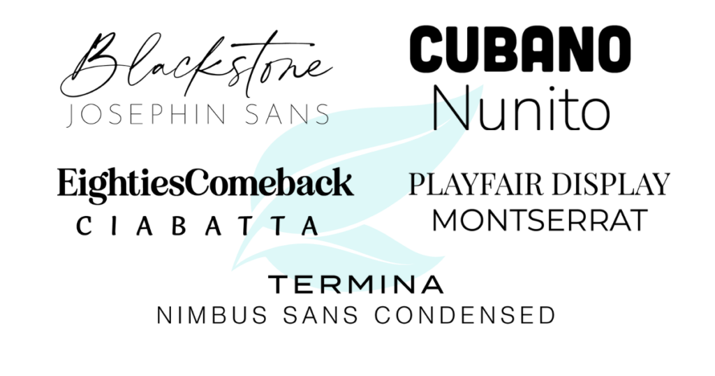
Let’s dive deeper into the suggested font pairings and explore what makes each combo special:
- Blackstone & Josephin Sans: This pairing is like a heart-to-heart chat over coffee. It’s personal and relatable.
- Cubano & Nunito: They’re the friendly neighbors always ready with a wave and a smile, accessible and engaging.
- EightiesComeBack & Ciabatta: Imagine a retro diner with a modern twist, serving classic dishes with a contemporary flair.
- Playfair Display & Montserrat: This duo walks into the room and commands respect while being utterly approachable.
- Termina & Nimbus Sans Condensed: They’re the power duo in the boardroom, exuding confidence and getting down to business.

How to Know It’s Love
Finding the right font pairing for your logo is like finding the right partner—when it’s right, you just know. The fonts will align with your brand values, speak to your audience, and differentiate you in the marketplace.
Let’s Talk About Your Brand’s Future
If this conversation about fonts and brand identity excites you, let’s take it further. Your logo is the face of your brand, and it deserves the same attention and care that you’d give to any crucial aspect of your business. If you want to explore how the right font pairing can make your brand stand out, I’m here to dive into that journey with you.
In this expanded blog post, we’ve provided an in-depth look at why font pairing is essential for your brand’s logo and identity. We’ve delved into the finer points that make each suggested font pairing special and how they can echo your brand’s unique story. It’s all about forging a lasting relationship between your brand and your audience, with fonts that do more than just ‘look pretty’—they resonate, they speak, they stand out.
If you’re ready to find the font that will tell your brand’s story in just the right tone, I’m here to help you make that connection. Let’s sit down together and talk about crafting a logo that’s as unique as your business. Schedule a free consultation with me, and we’ll start this creative journey together. Your brand deserves a font pairing that’s love at first sight and lasts a lifetime.
By booking a consultation, you’re taking a powerful step towards a brand identity that speaks volumes. Whether you’re refreshing an existing logo or starting from scratch, I’m excited to help you create something unforgettable. So, let’s chat—your brand’s perfect font pairing is just a conversation away.
Until next time, keep shining. ~Christi


Be the first to comment